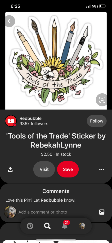
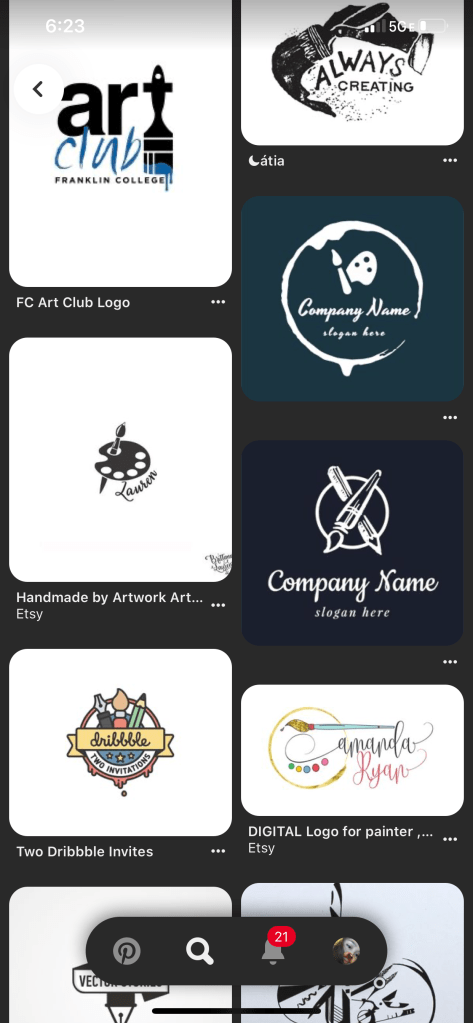
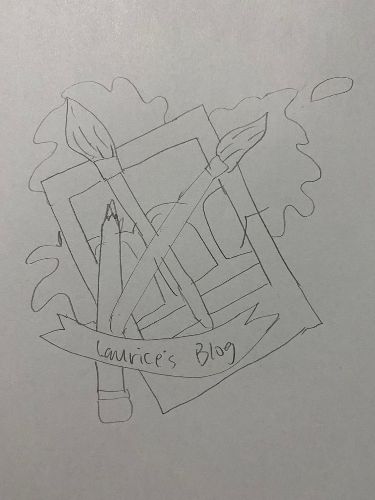
For this project, I decided to make a logo that includes a paint brush, pencil, polaroid film, and color splatters. I got my logo idea from Pinterest. I saved a bunch of photos from Pinterest and when i was done, I decided what i should include on mine. For this logo, I included some of the things i learned from the tutorials like making the banner and using gradient for the color.
I honestly didn’t really have a hard time making this logo. The first thing i made was the pencil, then the paint brush. After I made those two, I picked the color for them and that was the only part i had trouble with, picking the color. When I was done picking the color, I made the polaroid film and the paint splatter. Last thing i did was the banner. I chose to do the simple banner that isn’t really overlapping at the ends because it was easier to make.
The feedback i got for my logo was about the font and the color. The font I used before my final one was nice but it was hard to read from afar. While the color, it was too eye-catching that people wont notice my brand/site’s name. Revising my logo was hard because I always have a hard time with picking the perfect color. I changed the color from bright color to less bright, but i’m not sure if the colors are good enough that the people will notice the banner with the title. Another thing I changed about my logo was the font.
The sketch I made for my logo and the draft logo…
Here’s the screenshots I took on Pinterest…